Nervelin Official Website › Blog › Reading A Blend Label
Reading A Proprietary Blend Label As A Document
A Supplement Facts panel is a printed document produced by people under deadline, and it can be read the way you would read any other document: for what it says, for what it borrows, and for the small errors that tell you how carefully it was made.
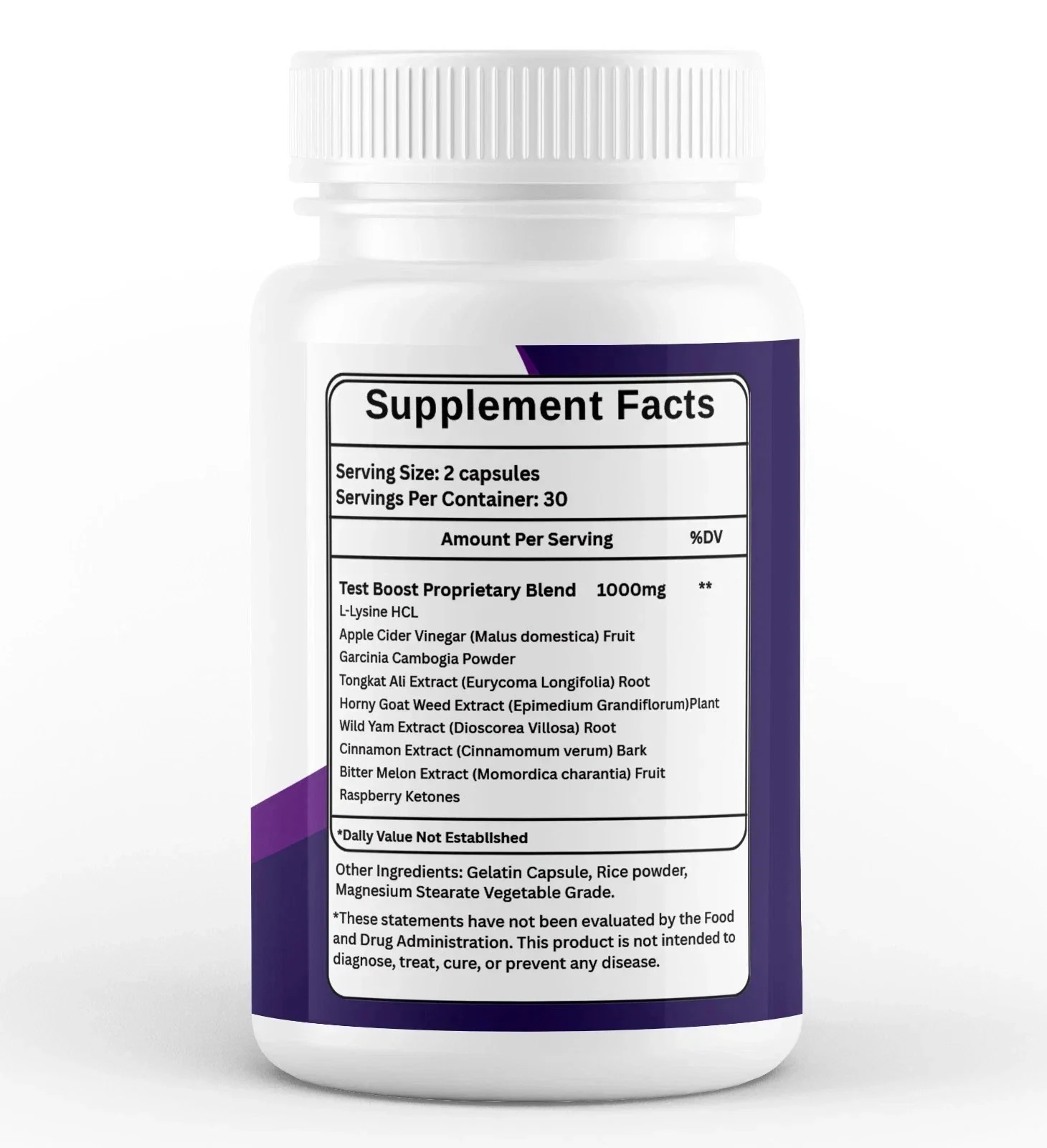
- The blend row's marker and the footnote beneath it do not use the same symbol.
- The footnote is printed with “Dally” where it should read “Daily”.
- The blend heading, “Test Boost Proprietary Blend”, names a category this product is not sold for.
- Seven of the nine rows carry a latin species and a plant part, which is better than most of this shelf manages.
- Small printing details are legitimate evidence about care, and they are the only evidence a shopper has access to.
Why a label is worth reading as a document
Everything a shopper can verify about a supplement is on the packaging. The manufacturing is invisible, the testing is invisible, the supply chain is invisible. What is visible is a printed panel, and it was produced by an organisation that made choices about it.
Those choices are readable. A label that names species and plant parts has gone to trouble that a label listing bare common names has not. A label carrying a typographic error has been through fewer sets of eyes than one that has not.
The 2026 paper on how shoppers read ingredient lists is about the opposite failure — readers supplying meaning a list does not carry — and it is a useful corrective to keep alongside this article. Reading carefully means noticing what is there, not filling in what is not.
The footnote marker that does not match
On this artwork the blend row carries a double marker and the footnote beneath it carries a single one. Those are two different symbols doing the job of one, and on a correctly typeset panel a footnote points back at exactly the row that raised it.
It is a small thing and it is genuinely small: nobody is misled about anything by it. The reason to notice it is what it implies about proof-reading, and proof-reading is one of the few proxies for care that a buyer can actually observe.
| What the artwork prints | What it should be | What it tells a careful reader |
|---|---|---|
| A double marker on the blend row | A marker matching the footnote beneath it | The row and its footnote use different symbols |
| “Dally Value Not Established” | “Daily Value Not Established” | A typesetting error that survived to print |
| “Test Boost Proprietary Blend” as the heading | A name describing what the product is sold for | The blend name belongs to a different category |
| Species and plant part on seven of nine rows | As many as the supplier can support | The most generous thing this panel does |
Four observations from the same piece of artwork, read at full size and again on a crop of the panel.
The site reproduces the panel with the mismatch intact rather than tidying it, because a transcription that corrects its source is not a transcription. The panel page carries the same note.
One letter, and what it is evidence of
The footnote reads “Dally Value Not Established”. It should read “Daily Value Not Established”, which is the standard sentence appearing under the panel of any product with ingredients that have no established reference intake.
The sentence itself is correct and appropriate. Botanicals do not have Daily Values, so the note belongs there. One letter has been transposed in a line that is boilerplate on thousands of labels and would normally be copied rather than typed.
What that is and is not evidence of:
- It is evidence that the artwork was not proof-read by somebody checking against a template.
- It is not evidence about the contents of the capsule, the facility, or anyone's intentions.
- It is the kind of detail worth one sentence on a website and no more, which is what it gets here.
A blend heading from another aisle
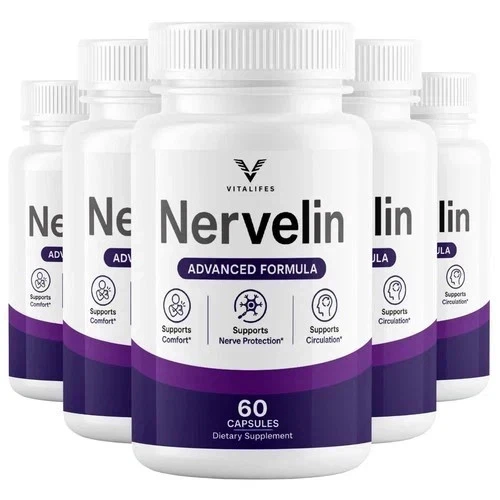
The panel is headed “Test Boost Proprietary Blend”. The front of the same bottle prints three structure and function lines: supports comfort, supports nerve protection, supports circulation.
Those are two different products described on two faces of the same container. One names a hormonal category; the other sells comfort, nerve protection and circulation. A shopper turning the bottle over is entitled to find the back agreeing with the front.
The most likely explanation is mundane and worth stating: blend names get reused across a manufacturer's range, and a heading written for one product travelled to another. That is a production story rather than a scandal. It is still the single most confusing thing on this packaging.
Once, on the claims page, and once here. It is not repeated in every section, because a fact stated well in the place it belongs is worth more than the same fact leaking into ten others.
The two marketing graphics in the asset pack
The same pack ships two violet promotional graphics whose wording reaches for cognition and focus. Neither of those appears on the bottle. This website places them as images with its own captions and never uses their wording as a claim, which is the only defensible way to handle artwork that goes further than the product it advertises.
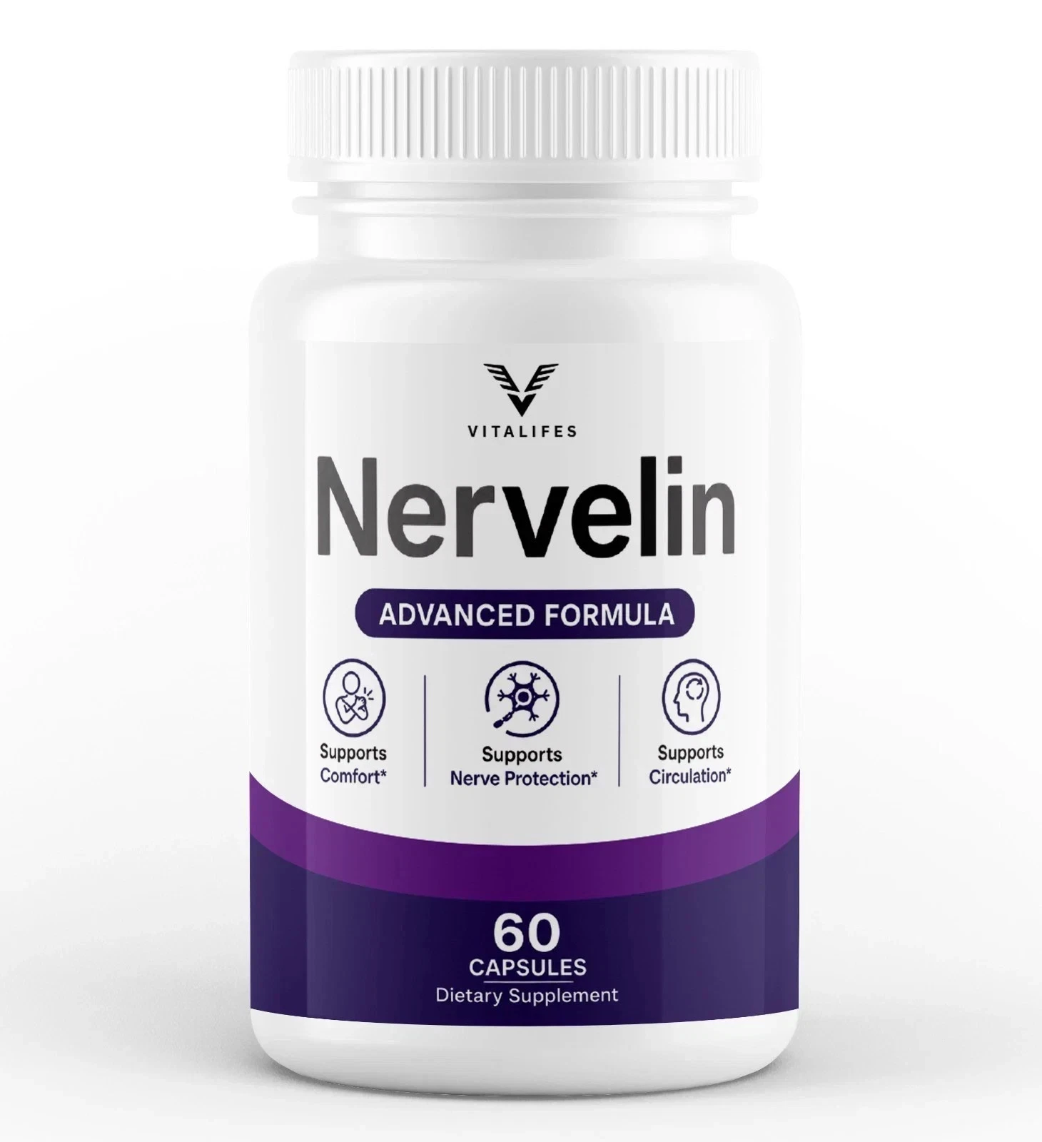
Nervelin: the panel transcribed exactly, typo included
Nine names under one 1000mg figure, the footnote as printed, and this desk's reading of what each row is and is not saying.
Two capsules a day · 60 capsules a bottle · price at the marketplace checkout
Order Nervelin On The Official WebsiteLot NER-26/GE-1959 · marketplace return window · gelatin capsule
The part this panel does better than most
It would be easy to write this article as a list of complaints. That would be a misrepresentation, because the same panel does something most of this shelf does not.
Seven of the nine rows carry a latin binomial and a plant part in brackets. Cinnamomum verum bark. Momordica charantia fruit. Eurycoma longifolia root. Dioscorea villosa root. That is specific, checkable information, and a great many labels print “cinnamon” and stop.
Why the species matters, using the cinnamon row as the example:
- Cinnamomum verum is true or Ceylon cinnamon.
- Most supermarket cinnamon is cassia, a different species.
- The two differ substantially in coumarin content, which is the only safety question this ingredient raises.
- A label printing the species has answered that question before it was asked.
That is a real piece of transparency and it sits on the same artwork as the mismatched footnote marker. Both things are true about this label and a fair reading holds them together.
Five checks on the printing itself
None of the checks below is about chemistry. All of them are about how a label was made, and all of them can be run in a shop.
| Where to look | What to ask | What a good answer looks like |
|---|---|---|
| The blend heading | Does the name describe this product's purpose? | A name a buyer would recognise as belonging to what they are buying |
| The footnote markers | Does each marker have a matching footnote? | One symbol, one note, no orphans |
| The brackets after a botanical | Is a species and a plant part named? | A latin binomial and a part: root, bark, fruit, aerial parts |
| The other-ingredients line | What is the shell made of? | Gelatin or a vegetable cellulose, stated plainly |
| The serving box | Do the capsule count and the serving agree? | Capsules per bottle divided by serving equals the days claimed |
Five checks on the printing rather than on the chemistry, all answerable in a shop without a phone.
The last row catches more products than people expect. A ninety-capsule bottle advertised as a three-month supply, taken three a day, is a one-month bottle, and the arithmetic is printed on the panel for anyone who does it.
NCCIH's guidance on using supplements wisely covers the wider version of this habit, and the regulator's own answers explain why the panel rather than the front is the part with obligations attached to it.
What none of this proves
A careful reading of a label is a reading of a label. It is not an analysis of a capsule, and nothing in this article should be taken as one.
A beautifully typeset panel can sit on a poorly made product and a panel with a transposed letter can sit on a carefully made one. The correlation between printing care and manufacturing care is real but it is loose, and treating it as tight would be exactly the kind of inference this article is arguing against.
The analysis of FDA supplement warnings describes the failures that actually matter at scale, and they are not typographic. They are products containing things their labels never declared, which no amount of careful reading would reveal.
- A footnote marker that does not match its row, and one transposed letter in boilerplate.
- A blend heading that belongs to a different category from the one the front sells.
- Species and plant parts named on seven of nine rows, which is above average for this shelf.
- One weight for nine ingredients, which is the limit nothing else on the artwork can get around.
References
- Alsawadi A. The Perception Filler: A Proposed Conceptual Framework for Ingredient-Interpretation Gaps in Food Supplements. J Nutr. 2026;156(10):101803. PMID 42660500. https://pubmed.ncbi.nlm.nih.gov/42660500/
- Questions and Answers on Dietary Supplements. U.S. Food and Drug Administration. https://www.fda.gov/food/information-consumers-using-dietary-supplements/questions-and-answers-dietary-supplements
- Tucker J, Fischer T, Upjohn L, et al. Unapproved Pharmaceutical Ingredients Included in Dietary Supplements Associated With US Food and Drug Administration Warnings. JAMA Netw Open. 2018;1(6):e183337. PMID 30646238. https://pubmed.ncbi.nlm.nih.gov/30646238/
- Using Dietary Supplements Wisely. National Center for Complementary and Integrative Health, National Institutes of Health. https://www.nccih.nih.gov/health/using-dietary-supplements-wisely